Redesigning a 3.5 million users payment app

Industry

Fintech

Client

bit

Role

Lead Designer

Duration

2 yrs (ongoing)

Team Size

7

Main Project Image
Main Project Image
Main Project Image

4 new features in development based on user feedback

4 new features in development based on user feedback

Feature discoverability increased by 32%

Feature discoverability increased by 32%

3 new revenue channels

3 new revenue channels

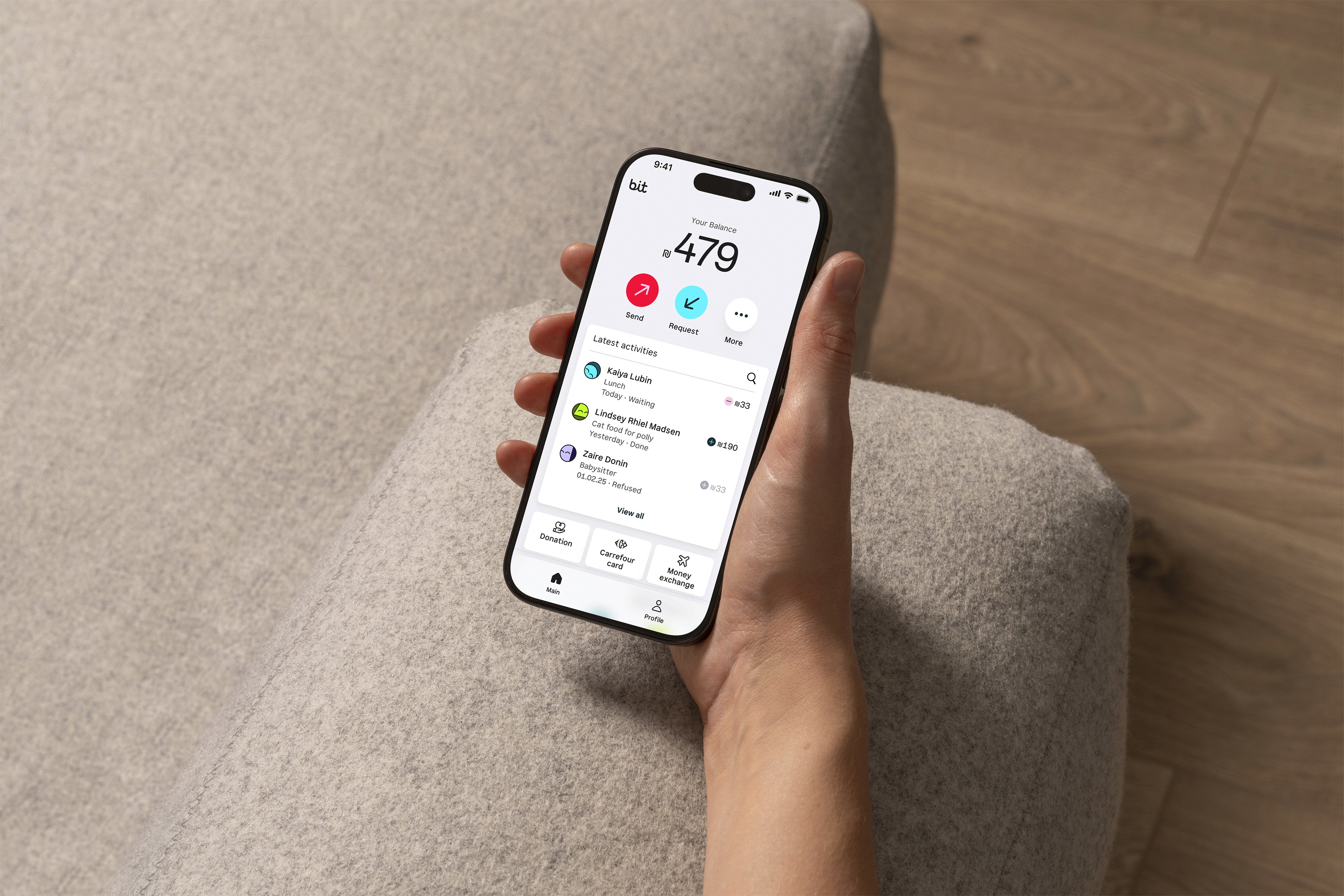
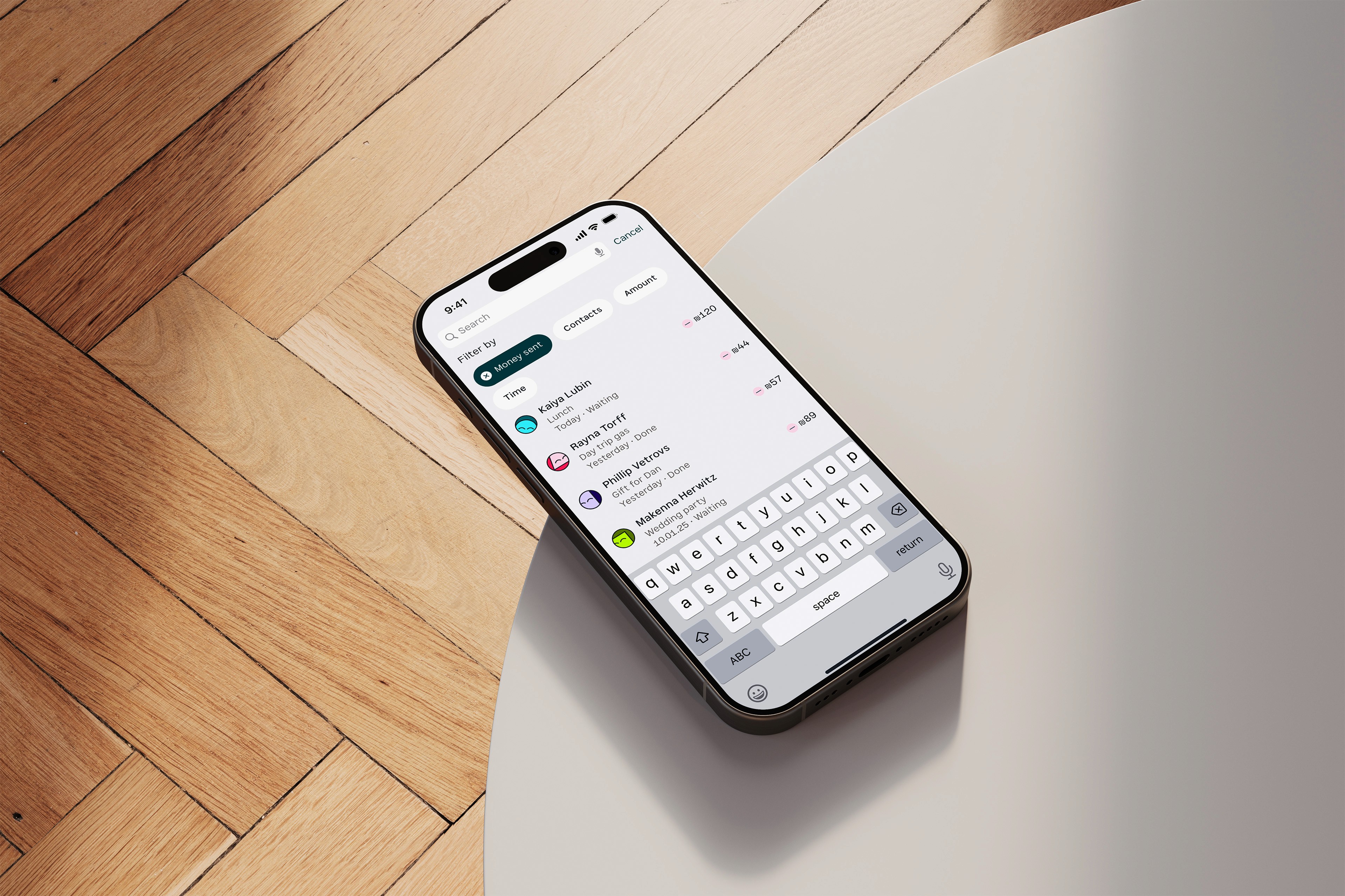
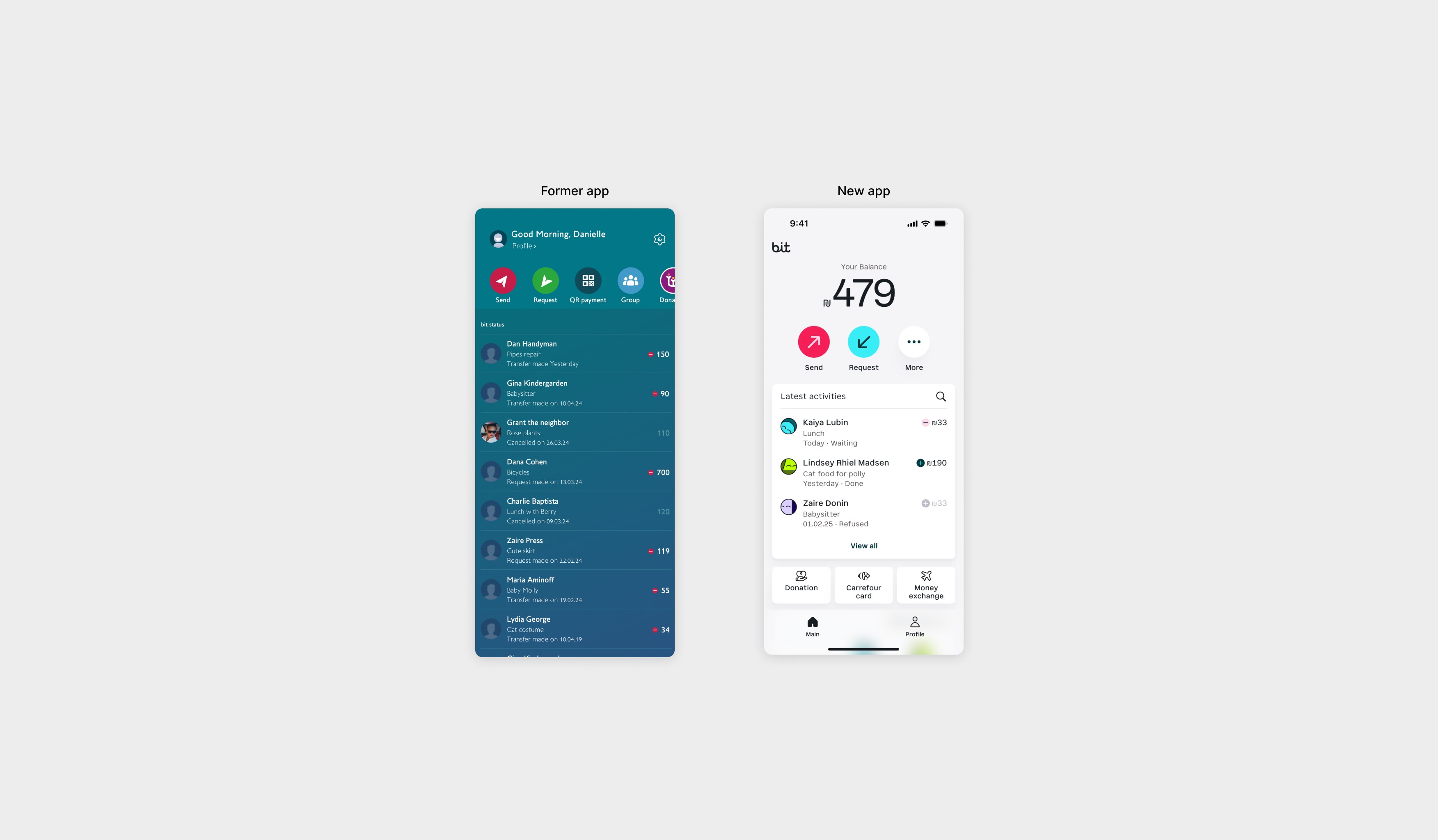
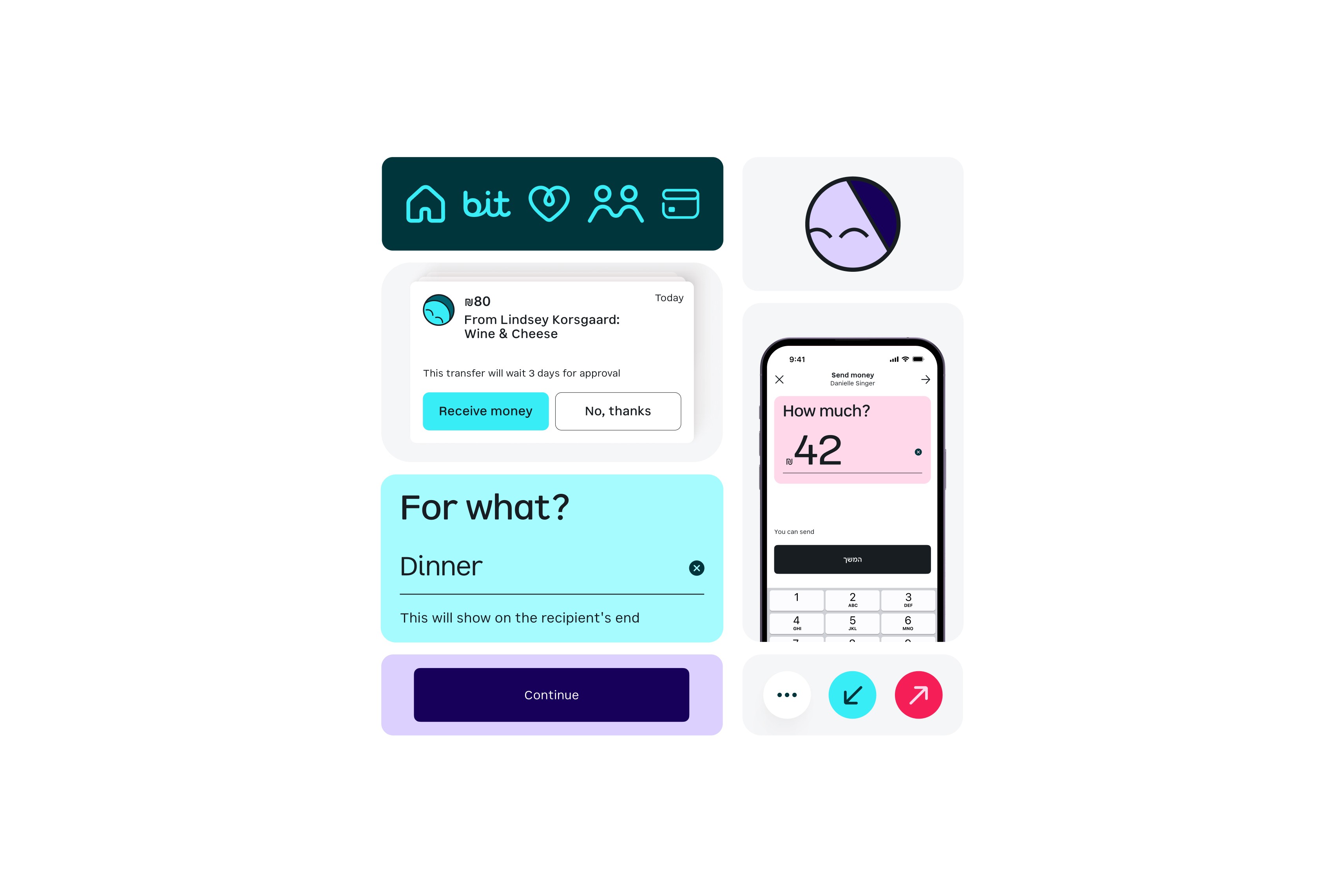
Reimagining the payment app of the future

The Challenge

Redesigning a beloved app for the first time since their initial launch, eight years ago. The goal was to support bit expansion beyond peer-to-peer (P2P) payments by adding substantial new features. We sought to evolve the app to launch a set of major new core business features, while ensuring its large user base experienced a seamless transition. Balancing innovation and stability was critical to maintaining trust and usability.

Role

As a Lead Product Designer, I guided the team through a sprint-based process, collaborating with all client departments. I managed the design process from discovery to execution and continue to lead ongoing tasks and new feature development.

Project outcome

A complete redesign and reconstruction of the app to align with bit's future business objectives. Launched in November 2023, the redesign was received tremendously well by both existing and new users. The positive feedback led to a one-year full-time contract extension with the client.

Large Project Gallery Image #1

Project's Process

Reserch & Knowledge Download

An in-depth exploration of payment apps and neo-banks, fully integrating with all company departments through stakeholder workshops, ideation sessions, and on-site learning.

Position #2

Position #3

Position #4

Position #5

Position #6

Strategy & Roadmap

To rebuild the app for future potential, we created a roadmap for the next four major releases, ensuring responsible decision-making throughout the MVP development.

Position #2

Position #3

Position #4

Position #5

Position #6

Design Experiements

Our design process began with a series of quick, intuitive design experiments that combined both UX and visual concepts. This approach enabled us to explore multiple ideas simultaneously during the UX concept phase. The goal was to avoid becoming overly focused on complexities and instead prioritize exploring as many creative options as possible.

Position #2

Position #3

Position #4

Position #5

Position #6

UX Concept

After numerous iterations and close collaboration with all of the client’s departments—including product, business, and marketing—we finalized a concept that stands out as distinctly different in terms of both app structure and visual design.

Position #2

Position #3

Position #4

Position #5

Position #6

Usabillity Testing

Once we had a nearly finalized UX concept, we conducted qualitative research to understand how individuals from different age groups and varying levels of app proficiency perceived and accepted the proposed changes.

Position #2

Position #3

Position #4

Position #5

Position #6

Visual Design

We made significant progress with the design in earlier stages. In this phase, we worked in iterative sprints to finalize the visual language, including colors, icons, and text styles. We created a dynamic design system that continuously evolves. Additionally, we collaborated with external providers on custom fonts, illustrations and animations.

Position #2

Position #3

Position #4

Position #5

Position #6

Large Project Gallery Image #4
Large Project Gallery Image #3
Large Project Gallery Image #2