Colmobil Digital Showroom
Designing a new automobile online purchase experience
Desktop + Mobile
About the Project
Colmobil is the biggest automobile importer in Israel. They aimed to be the first in the country to launch an online purchase experience. Our goal was to understand the car purchase journey a person goes through and provide an updated, fun and efficient experience in an old fashioned industry that doesn’t have an e-commerce presence right now.
My role was leading the design team in all research, user experience and design stages. We worked very closely with the client’s VP of Strategy, Business Development Team and Product Manager.
Colombil is the official importer of Hyundai, Mitsubishi and Mercedes in Israel. While being a traditional company, they understand that the automobile world is progressing rapidly. As we interviewed key stakeholders they emphasised their desire to be innovative but still keep the values of quality, trust and legacy the company is based on. This constant balance between the stakeholders opinions and the trends in the automobile and e-commerce worlds was our challenge.
User Research
Secret shopper
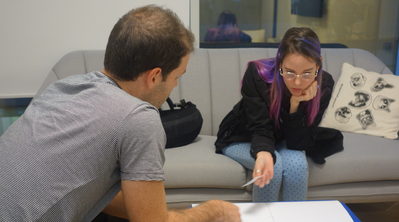
We visited our client’s and competing agencies as potential car buyers. We experienced the sale process with the representatives: asking about our needs, showing us different cars and making us an offer. It was necessary that we understand a person's journey in the showroom so we can map and understand positive points and pain points.
User interviews
We interviewed car owners about their car purchase process. We realised how emotional and triggering buying a car can be because of the length and cost of the process. We interviewed a wide range of costumers that differ in age, socio-economic status, technical knowledge about cars, etc.
Design Research
We investigated different e-commerce benchmarks, not necessarily car related. Buying a car is not an everyday experience unlike other product we buy online. We needed to find the balance between the familiar e-commerce experience and the car purchase experience (which is usually not digital) and create a platform that will use the e-commerce tools wisely.

Some of our references (left to right)- Tesla, Oscar Insurance, Seat

Prototyping
The first stage was making a prototype in a one month time compressed process. The idea was to address the main issues that were raised in the research stage and see as soon as possible if we are on the right path. We had a few main principles for our prototype based on our findings (some of them are new to the automobile industry):
  1. Transparency about the price throughout the whole process
  2. Common, familiar e-commerce features
  3. Communicate in a language that the customer understands (in a way that suits both technical and not technical costumers)
  4. Appeal to the customer’s common sense but also to their emotional side- make the experience exciting and personal
  5. Design for mobile first- the most common tool of searching online
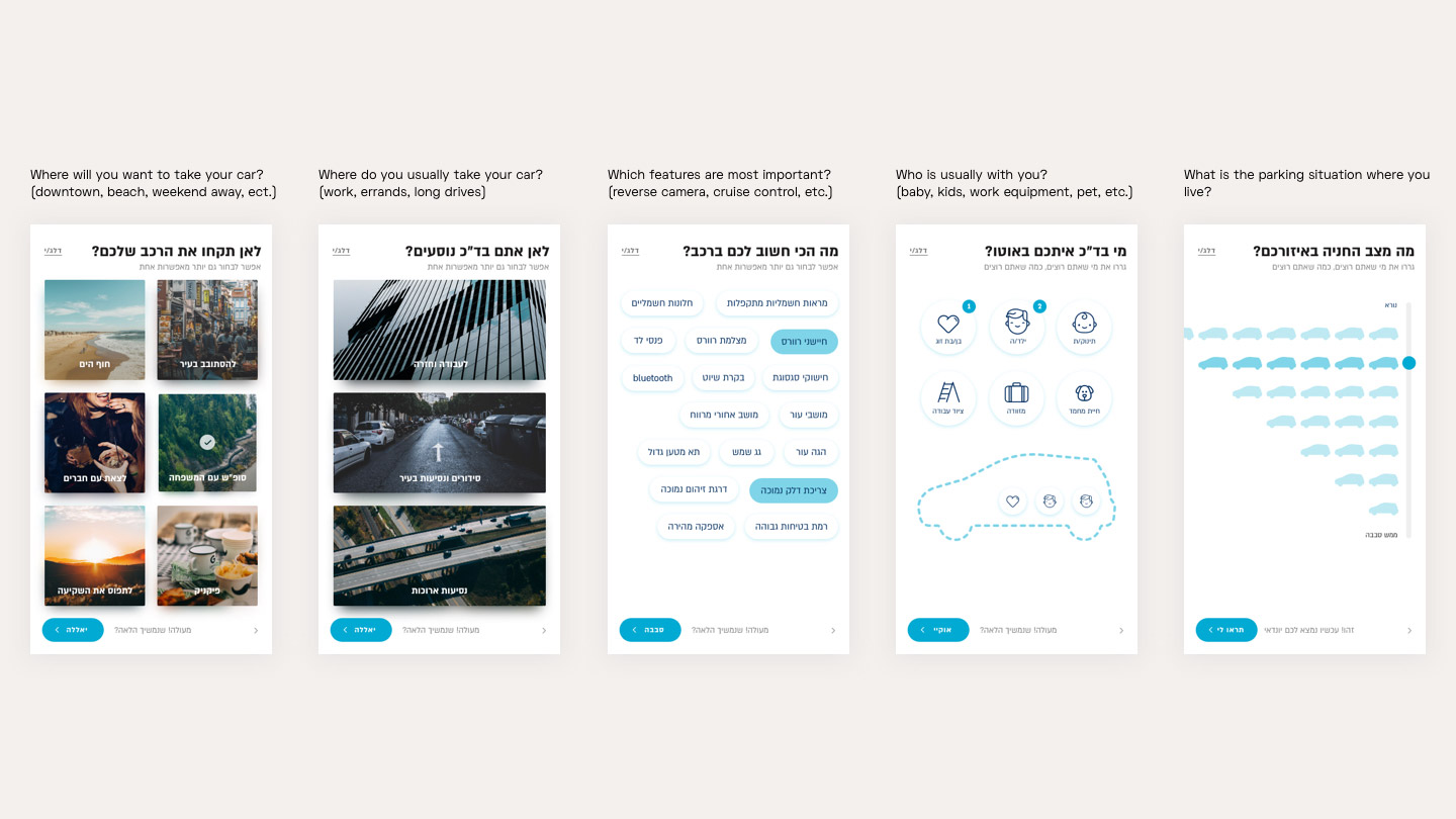
We designed a prototype that starts the purchase flow with a series of questions about the costumer’s wants and needs. The costumers will be offered cars that are compatible to to them, and not a list of all the vehicles that are offered. Another goal was letting the costumers imagine their lives with the new car- translate the technical lingo into actual experiences.
Experience & Visual Design
The prototype purpose was to get the client excited about the possibilities we have for enhancing the car purchase experience. We wanted the website to be accessible for different types of clients with different levels of knowledge. Some Ideas from the prototype were not implemented in the MVP version, but it set the tone for the experience we aimed to provide. We worked on UX and UI simultaneously while refining both during the process. These are examples of designed screens from the website (all of them were designed both for desktop and mobile).

Main page- presenting the car collection with easy access to details

The Configurator
The configurator is designed for an interactive, enjoyable and informative car selection process. The subject of price transparency is key- every change immediately shows the price difference. According to our user research many clients were disappointed from the process in the physical showroom and felt the “real” price of the car was only revealed at the end. The navigation on left shows an overview of the steps. This configurator allows playing around with options and making an informed decision.

Comparing the different modules and a closer look of the special features
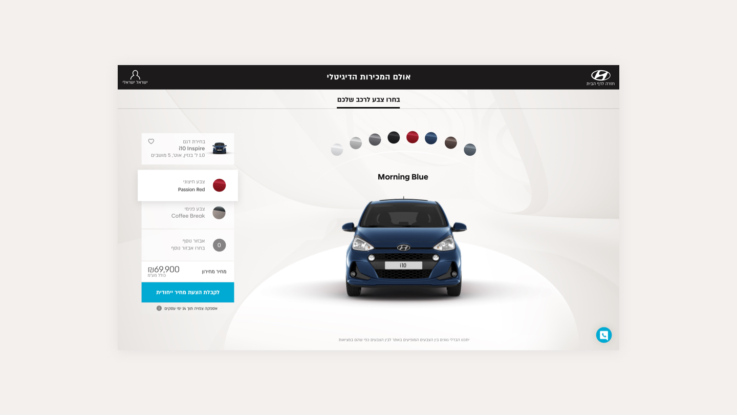
Color choices
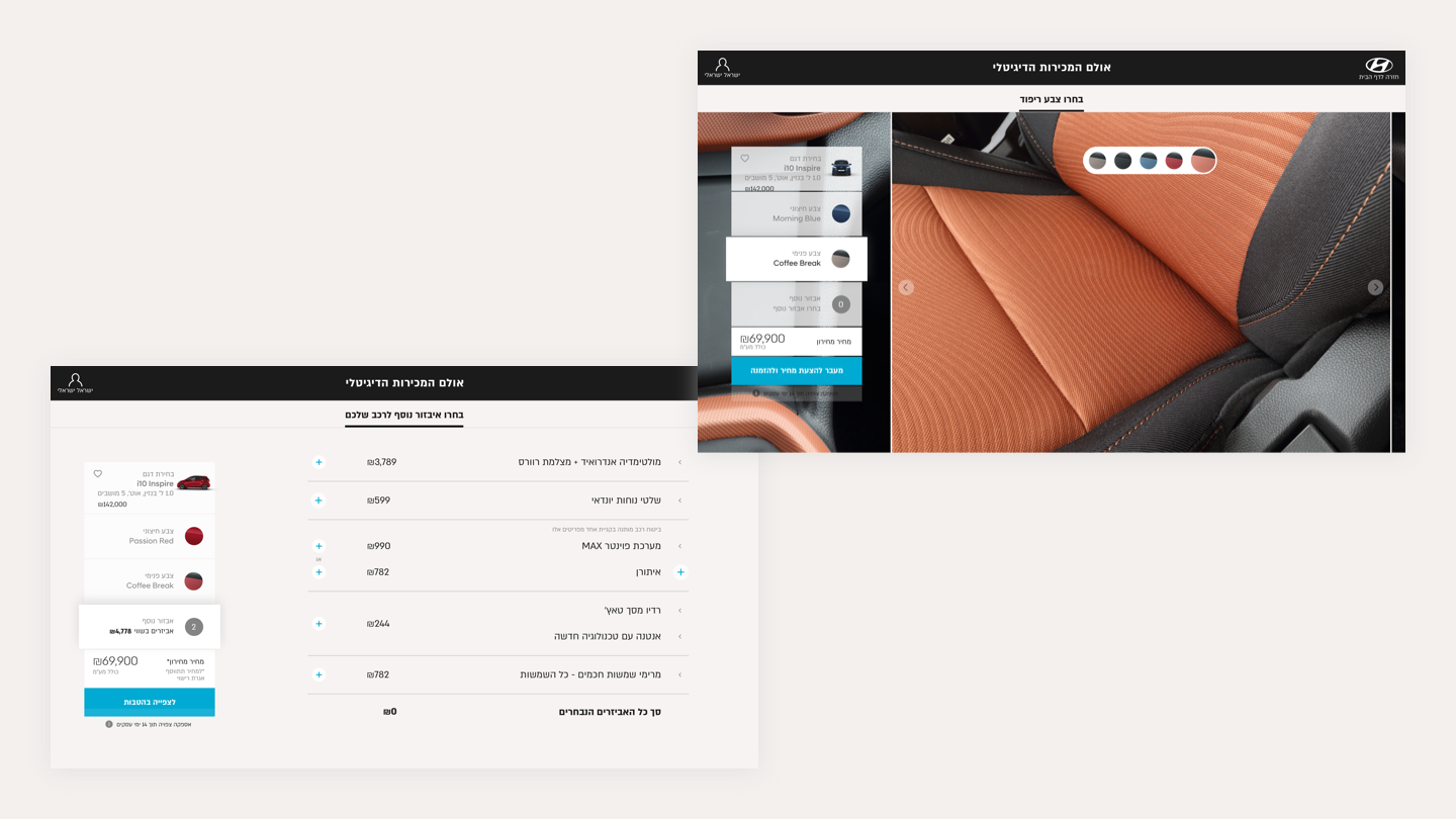
High-res images of the interior with color options (right) and accessorise you can add and see how the price is effected (left)
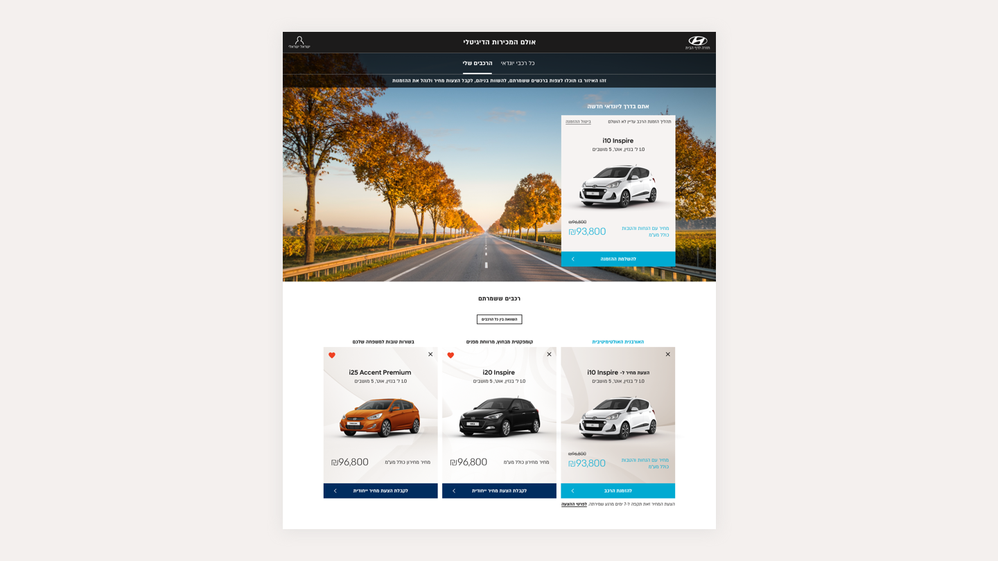
Personal Zone
A space where the costumer can save and compare different offers that were configured. If a purchase is already in process, this is the place to track it at any time with useful information and timetable (for example: Your car will arrive in 2 days!).