myRaiffeisen
Changing the narrative about personal finances
IOS+Android
About the Project
One of the largest banks in Central and Eastern Europe, Raiffeisen Bank International (RBI) wanted to increase customer engagement while growing into the regional mobile banking market. The object was to design an app for everyday life that will help costumers with money management that is compatible for their lifestyle. Our focus was the Eastern European market.
Concept
For the app to be compatible for everyday use we wanted to understand our users most urgent needs. We conducted user research, mapped different apps that are popular in Central-Eastern Europe and held user interviews.
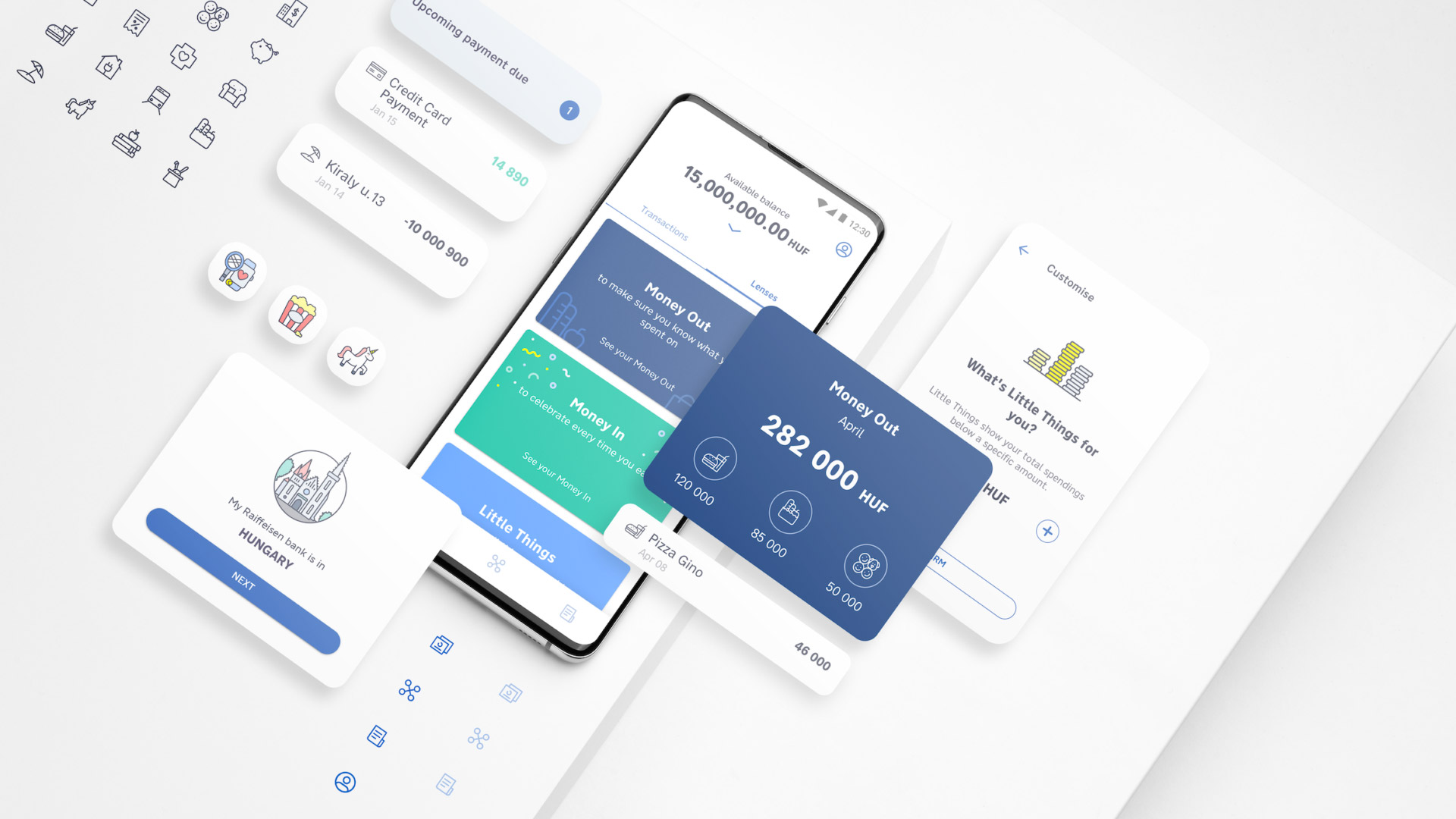
We developed a new approach to banking by creating a meaningful narrative around personal finance. Traditional banking apps cluster spending in categories like “Restaurants” and “Clothing”, but our research revealed that users don’t think in categories – they think in contexts. For myRaiffeisen, we created Lenses, an innovative approach that lets users group their spending in ways that have context and meaning. For example, “Little Things” includes all expenses below a certain amount, showing how much is spent in small purchases that you may not notice.
Set what "Little Things" means to you so you can keep track

Lenses bundle spendings with context like Christmas spendings and all incomes

The Team
I spent six months living and working in Vienna. The team of approximately 40 had product managers, business designers, developers, scrum masters, testers and UX/UI designers working in the same space. It consisted in-house RBI members, professionals from Deloitte London and designers from Designit with around 30 nationalities.
Working in Sprints
The workflow was constructed in a way that allowed as achieving meaningful goals in a short amount of time. We worked in teams, each in charge of a set of features. While working in sprints we thought of new features, designed the experience, perfected flows and tested them in real time. Our big team worked simultaneously on user stories, usability testing, UX improvements, etc. Sprints helped manage all aspects of this complicated, multi players process. In every sprint a new version of the app was released so we were working with the actual product.
Experience & Visual Design
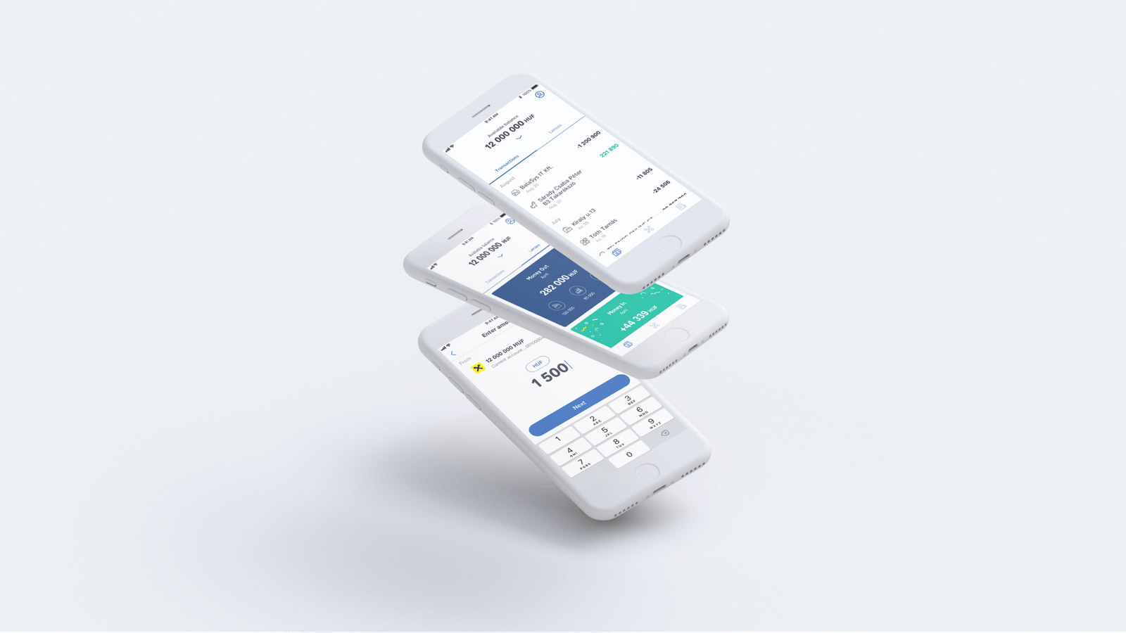
We designed a simple, intelligent daily banking experience for both IOS and Android. It was important for us to build a strong and easy to use design foundation that the brand can evolve from. The experience allows the user easy navigation through the app while emphasising what is really important- overview of all finances, quick actions and an easy to follow transactions list.

Transaction details, categorisation and empty state (left to right)

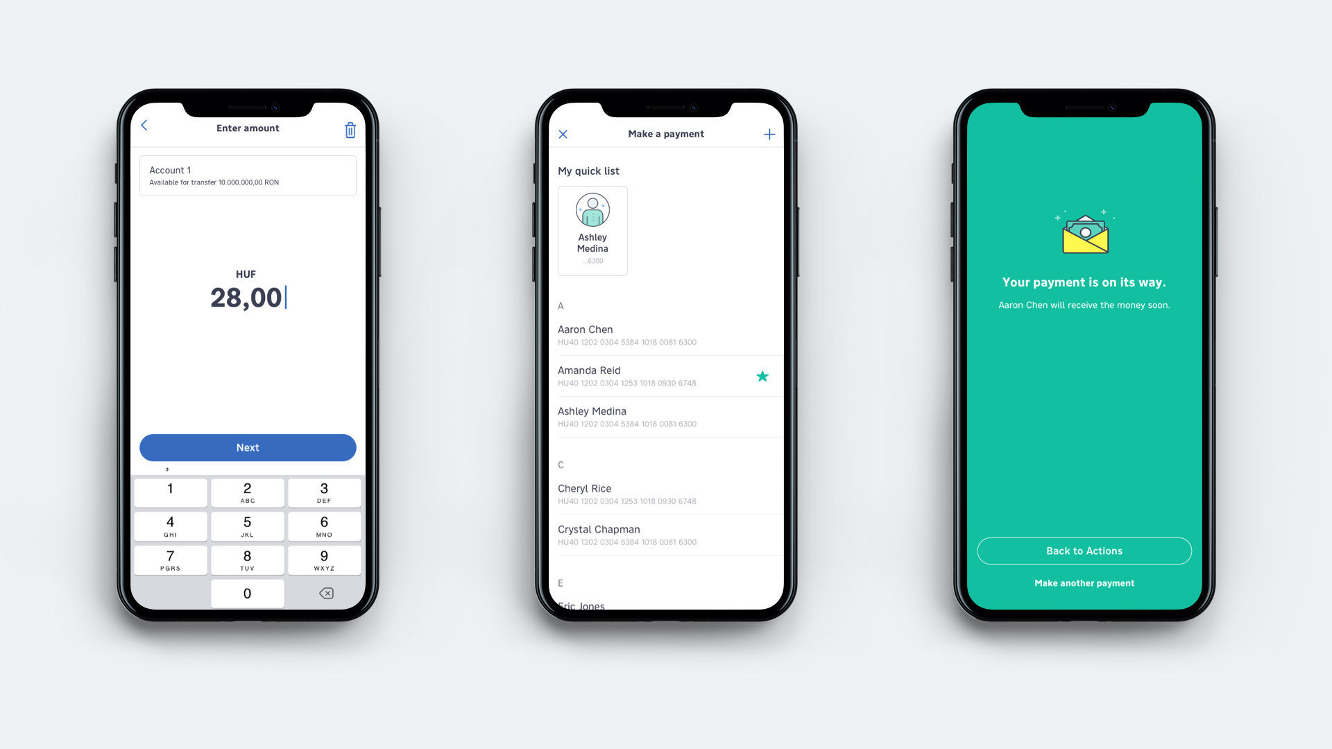
Simple payment flow